Competitors like the Fender Tone Master Pro and Line 6 Helix Stadium are going big on skeuomorphic design (realistic amps/pedals on screen).
Personally, I find this approach a bit unnecessary and even less professional-looking. It feels like “pretty pictures for the sake of pretty pictures.” Especially on the Quad Cortex, where the hardware already provides physical dials and controls, skeuomorphic graphics don’t really add functional value—they just duplicate what’s already there.
NeuralDSP’s plugins rely a lot on skeuomorphic UI, so it seems to be a conscious design choice in that part of their ecosystem. But on a hardware device like the QC, I think a clean, minimal interface is more in line with good UI/UX practices.
What do you all think? Do skeuomorphic designs actually help usability on these kinds of devices, or are they mostly marketing polish?
Sometimes it’s fine. The Helix Stadium design is kinda funny because they pick such weird angles of view for the amps and pedals. It’s like- hey want to see the amp? Well you can see it sort of from the side awkwardly (which honestly sucks).
I tried a Fender Tone Master the other day and I gotta say- the touchscreen was horrible, and the image of the amp made the control names on screen look super small. It was actually annoying to see the amp, and then in super small text the control. I prefer the QC layout since it’s very clear and simple. Anyone getting too focused on the image of the amp really should focus on their playing and songwriting tbh. Unless these companies can come up with a better way to display the controls clearly with a fancy UI.
The screen having essentially photos of the gear looks cool when you see the modeler advertised online, and then when you’re actually using it they’re super distracting.
Back before PCOM happened on the QC there was a lot of speculation about what the plug-ins would look like once they were added. Would they follow the fancy UI design of the plug-ins on the QC’s screen, or would they follow the existing “clean” design of the QC?
Along the way we learned that the QC’s screen doesn’t actually have the resolution to replicate the fine amount of detail in plug-ins like the Gojira, Soldano, etc. So the parameters for those looks the same in the QC as other blocks. As long as it sounds good and remains easy to use, we’re happy.
My beef with it is that the knobs don’t reflect the real positions of the knobs. They’re literally just “photos” of the amps and effects. Not a huge deal, though.
I like how NDSP does it. I do like visual knobs, toggles, and sliders. I REALLY don’t like the way the Helix Edit and Native JUST have sliders. That’s super annoying. NDSP does it well; knobs for most things, toggles for any two-option parameters, and faders/sliders for EQ.
I don’t need pictures of the actual effect if it’s just going to be static. I think Line 6 only did it because (a) they HAD to use that big beautiful screen for something and (b) they didn’t want to go full skeuomorphism (to which they confirmed it would be a lot of extra work and delay things with higher priority).
I think they also needed some kind of nice looking background to show their ‘focus view’ feature. That feature where you can ‘morph’ parameters between 5 different presets of an effect or amp.
I don’t know how much sense that feature actually makes. Perhaps it is interesting to play with…
I’d much rather like the possibility to select between any X amount of amp/effect presets.
Seems like a lot more work to have detailed images of the amp/pedal from strange angles than to just have a super simple head on image of the gear haha. Like it could have just been a flat version of the gear from the front. Would have been way easier to look at, rather than whatever angles they chose that seem more complex and annoying to create tbh.
Want to edit this Revv amp with a ton of controls? Ok, here’s an awkward looking illustration of it from the side
Not a big fan of skeomorphism either, I much prefer a clean, easy to read interface. Rather have it sound like a Marshall/Fender/Vox/Soldano/whatever and I can see what settings and audio path are at a glance that have fancy graphics and not be able to read settings easily.
Honestly I’d rather retain the current graphical design than try to keep up with the Jones (or, in that case, the TMP) and make it more cluttered…unless there’s the option to retain the current interface.
When I tried the TMP the other day it was really like- yeah this is a toy in comparison to the QC (as far as how the UI and touch screen was functioning). I do like that they have the strips above each footswitch though. It’s a cool combo of the QC and Helix for that design
I would say it depends. It can help you find your way around more quickly. However, it requires that you have a sufficiently large display area available.
If a pedal looks like the real pedal, you can recognize it more quickly. But it also takes up more space. And if there are many pedals on the display at the same time, the advantage turns into a disadvantage. Then it becomes rather confusing.
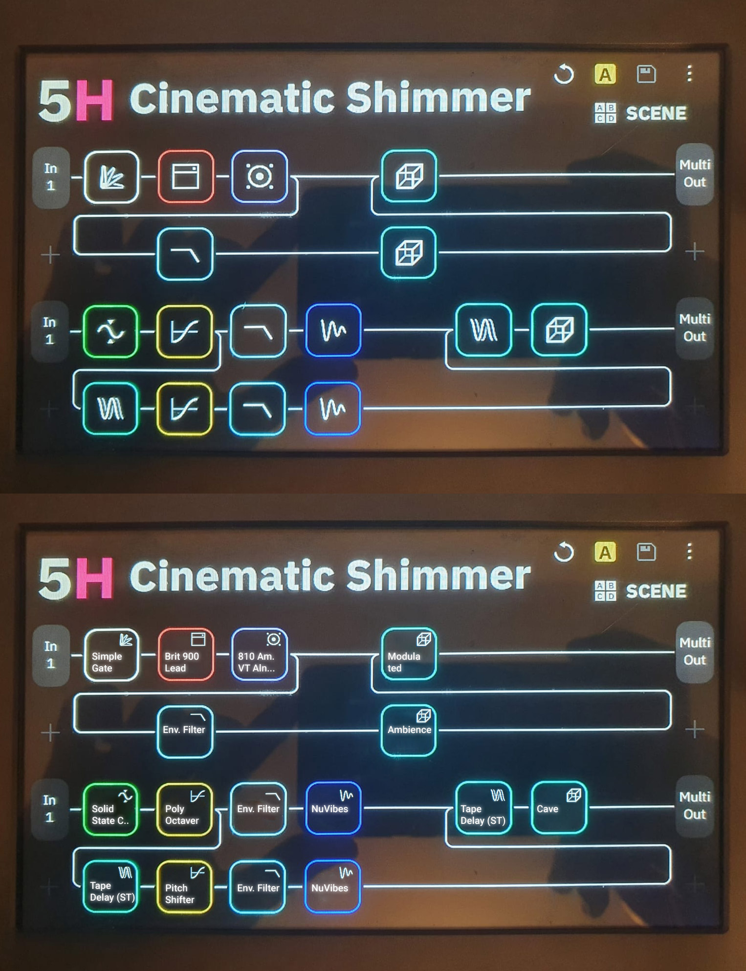
However, the current user interface of the QC is not the last word in wisdom either. From a UX perspective, working with icons alone is also rather disadvantageous because many icons are not self-explanatory. This is especially true when entire pedal groups have to share an icon. The QC’s UX would benefit significantly if text could be added below the icons to indicate exactly what effect is involved. Currently, with many blocks, you first have to go into the block to see what exactly is behind it.
Apple abandoned Skeuomorphic in 2013 for a reason, although it might be easier at first for someone coming form the analog world, it’s not the best use of a touch screen and it doesn’t make for the best user experience. Also how many new players come form using real amps.
I also honestly think that the Fender Tone Master Pro looks dated because of skeuomorphic. It kinda looks like an old version of Amplitube.
There’s not enough space to show text above or under the icons. It would make the UI cluttered and the text would be difficult to read as it needs to be small.
A better approach would be to add more icons like Line6 is doing with the Helix Stadium. It already shows a difference between say a distortion, an overdrive and a boost.
Cortex Control could do with a tool tip of sorts to immediately show the block name, like f.i Vemural Ray. Preferably in a new helper window (and add some preset functionality there too somewhere lol)
Line 6 really did think of it all when they put the Stadium together haha. Love my QC, but props to Line 6 for what they’ve been putting together for this new Helix.
I don’t love the amp images I’ve seen for the stadium, but they really have some good UI/UX ideas otherwise and sorta set the template for modelers with the original Helix
Yes, it will be quite small, but you mustn’t forget that when you want to program presets or change parameters, you usually get very close to the device. You don’t need to be able to read it while actually playing the guitar, because you’re playing the guitar and should better not thinking about the arrangement of the individual blocks :-).
A tool tip is not a solution, as you still have to actively click on a block. You can already do that now. It doesn’t make things any clearer.
Totally window dressing. I rather see a graph of some sorts showing sound characteristics or the like. And a list of alternatives for the unit chosen. You get my drift.
Unfortunately, the only reason the pictures exist is to show a visual example of what the pedal is. The knobs don’t move anyway, and you can clearly tell it’s supposed to be an Echo Park - there’s just no way to please everyone. Personally, I hate that they’re putting in all these beautiful pics of the pedals and yet they’re all just static images. I still feel they should make the knobs reflect their actual positions, but that’s a losing battle to the overwhelmingly ant-skeuomorphism crowd.
Rather than relying on the cheesy, static lookalike graphics of original gear—as seen in Line 6’s approach—I’d much prefer a simpler, more functional option: just show the real names of the devices.
To avoid any copyright or trademark issues, Neural DSP could introduce the ability for users to provide custom aliases for devices and leave them blank by default. This way, we the users can label things clearly—Marshall JCM800, Boss CE-2, Klon Centaur, etc.—without Neural DSP being directly responsible for naming or visual likenesses.
The community could then maintain a shared JSON or XML file of these aliases, which users could load into their setup if they choose. It’s a simple feature that would drastically improve usability without putting the company at legal risk.