Any chance that the block icons could show info on which device is being used eg not just the overdrive symbol, but also which overdrive? It would be great if all devices just had a little code or name eg “Myth”, “808”, “USSRN” , “FDR”. These are bad examples, I know …
I know that there are many permutations, meaning they might not be able to give all info. But it could be good to be able to see everything, especially when you are building new presets and are unfamiliar or changing from preset to preset.
Thumbs up on this request!. The icons are too general. They can encompass an entire category of effects, or any number of amps or captures. “Modulation” for example covers a lot of ground. Is it a flanger, phaser, chorus, etc… ? A text-also option would be much more informative. Small amount of real estate but you could cram a few significant letters in.
It is a pipe dream, but I would also like to be able to use custom icons. DIY, load up your own with whatever image/text you can fit on it.
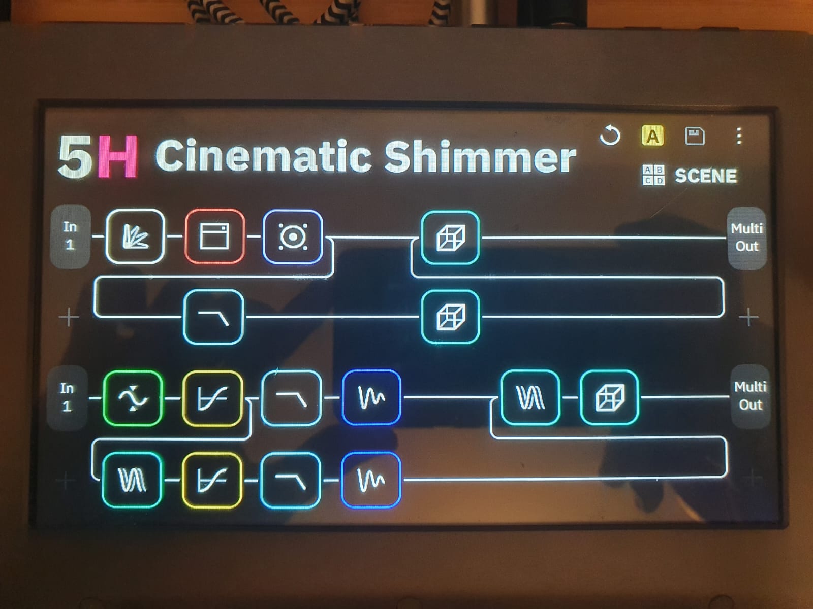
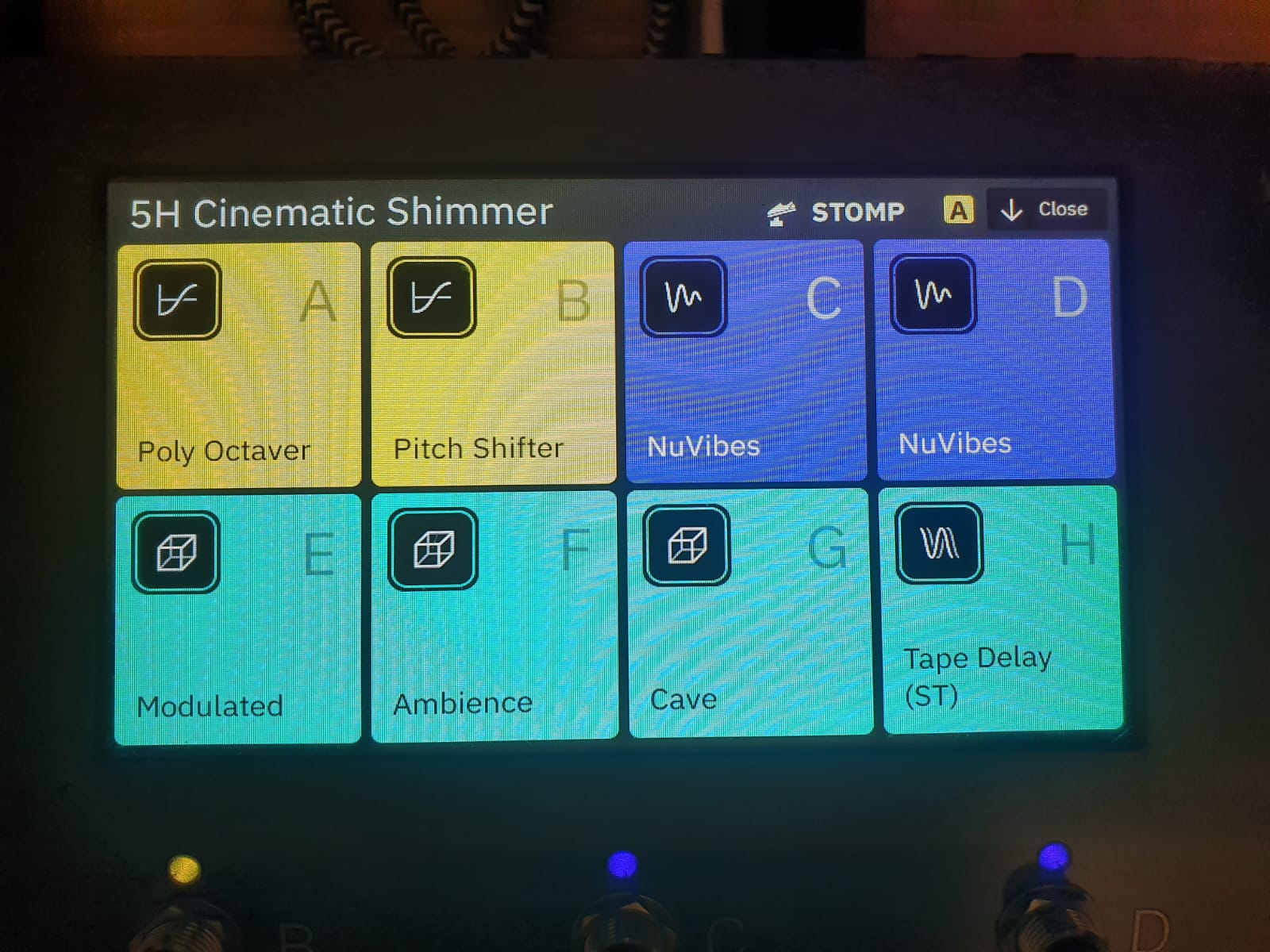
Where would you add the text that says the pitch block on row 3 is Poly Octaver and on row 4 is Pitch Shifter? You need to either make things smaller and more cramped, or make the text tiny.
On the floor, you have gig view, which could be better (e.g. increase font size), but does give you all the info you need for live playing:
I’m not trying to dismiss this idea, but I think it will be more useful if it were given a more concrete idea on how to add info in a useful way.
Off the top of my head, maybe you could add another “zoomed in” view, where rows and columns are more spaced out, giving room for text. The price you pay is you’d need to scroll left-right and up-down to access the entire grid. Since swipes are reserved for gig view and I/O menu, you now need to add buttons, which also take real estate. But - that’s just another view, some might use it, other might stick to regular grid view, so no harm done.
The idea is to make locating a block while editing simpler/faster, as well as being able to get a complete bird’s eye view on all the blocks being used in your preset - this requires more information on each block be visible from the grid/editing view. Gig view is, as you say more geared towards live playing and does not necessarily include all blocks in your signal chain.
You would add the text directly in/on the blocks. As you also mention, difficult to see where else there might be room. You would probably use abbreviations like ‘P-O’ for Poly Octaver, or ‘P-S’ for Pitch Shifter.
Retaining some sort of icon or design in the background of the block, as we currently have would be ideal as it would give you both an icon/design, and/or text, as options - and visual cues.
For getting a quick overview, what fx is on what block it would be of cause the best to label the blocks in the right way. This would be essential for programming sound. For live situation this is of course not necessary. How easy it is to make this clearer I have once tinkered in 5 minutes with Photoshop.
It’s really annoying to have to click on the block each time to see exactly what effect it contains. Especially since the icons sometimes do not speak for themselves and are rather generalizing.
Looks really good!
If you add the text inside, I’d say the icon becomes somewhat redundant, so maybe it’s even better to ditch the icon altogether to allow for larger more readable text, and only keep the color coding.
If the choice is left to the user whether to use an icon or text, I’m sold on the idea.
The icons are quite important, because due to the available space, the words probably have to be abbreviated more often and from the pure effect name it is not always immediately clear what kind of effect it is. Only text would not make the operation much easier. You would only replace one problem with the other.
I agree that the color of the block is more quickly discernable than the icon. With the icon gone, that would leave more room for larger text. The font size could start larger - then get smaller as more characters are added - to fit the block if necessary. I would opt for short abbreviations: PH = phaser, KoT = King of Tone, ANA = analog delay, etc.
If possible, perhaps a ‘mode’ option - so there’s a choice between ‘icon’, ‘text’, or both.
Yeah, that’s what I have in mind.
In the suggested pic the text is smaller than e.g. the “In 1”, and I wonder how legible it will be in practice. Also keep in mind that the QC’s screen resolution isn’t very high: the existing text on the grid is exactly 2 pixels wide. So you can’t really reduce it “just by a little bit”, as there aren’t many spare pixels for anti-aliasing etc.
Yes, the text is 1pt smaller than the In and Out-Text. But keep in mind, that this view is normaly used for programming the sounds. So I assume, that the most users are quite near to the device when twiggeling around with it (with in reach of an arm length), so the font-size shouldn’t be a problem. I think most of us have their QC on the table when you are working on the sounds.
Oh, and you don’t have to read it when you are standing and playing your guitar on the stage :-).
Many years ago, I requested text be added as an option to the Helix icons. Over subsequent years, I would bring it up every once in a while. Excellent as the Helix UI is, this is one request that has yet to happen. I hope Neural decides to do it at some point on the QC. It seems like such an obvious improvement to me.
Let’s leave the option of a design/color/icon and/or text in a block. Best of all worlds. If one of the modeler companies would just come up with a standard grafx/resolution format for a block and allow us to upload them, the design would be up to the user. Best case, they even provide a block designor.
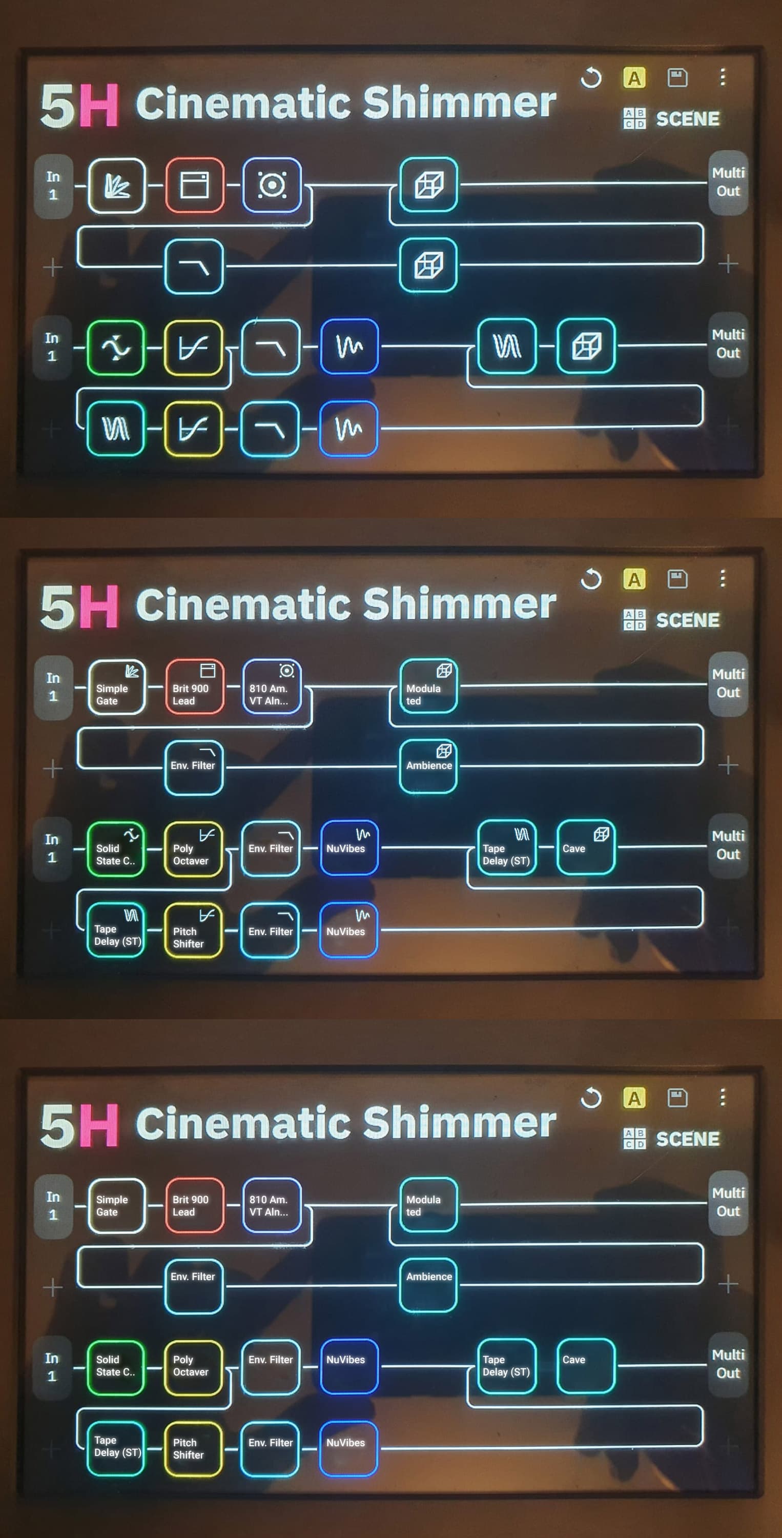
HI, I was just curious how YehonatanV example would look like with icons & text and with only text. Don’t know if the labes are the real correct Fx but I think, a real world expample give one a lot better feeling about the improvement. Without the icon I think you are loosing a lot of overview, because you realy have to shorten the name quite often and you don’t gain a lot of space for more text because of the fixed width of the boxes.
Especially with the reverb effects in this example you can see nicely that you know immediately which reverb is used where. Without text, you would have to open each block directly to find the cave rever, for example. Especially if you didn’t build the patch 5 minutes ago but a few weeks or months ago or if you loaded the patch of another QC user to adapt it.
At the top you see the original image, the the text&icon version and the text only.
Great job on the mockups! Thanks! The second one for me please.
Would like to suggest a third option where the icon is in the background but even larger than the current default. Almost pressing up against the border of the block. The text is then superimposed (with a background text “box” if the text is being washed out by the background, like the ones you see in subtitle options). Would love to see a mockup of that.
Along these lines, if the background design selection was flexible enough, it could allow a custom design rather than an icon. You might find yourself wanting to swap out the small icons in the 2nd example for distinctive patterns, or even low-res pictures, that filled the whole block. And then superimpose text (w/ background text box when necessary).
+1 to everything people are saying… either text + image just text or just image.
Possible fixes:
-Add more symbols maybe preserving color so it can indicate - modulation - one color for chorus, another for flanger
-Add text
-Keep symbols and colors and superimpose text
-Add custom inputs for text or images - one could load the image of a pedal OR text as code for each pedal or it´s use… say the text “friedman OD channel 2” won´t fit well one can just type “BST” as in boost which could be the use or “S” for solo, etc you get the idea