I find the purely graphical icons on grid to be frustratingly limited in conveying information.
Yes it’s a reverb but that’s all I know looking at the grid. Is it spring or hall?
Yes it’s a capture, but is it a pedal, an preamp, an amp, an amp + Cab, a pedal + amp + cab?
Particularly problematic when using factory or others presets.
Please allow for at least a small amount of text to overlay the block.
Agree, some form of short name to indicate the specific device would be helpful to be able to toggle on/off via settings. Again this requires that people making captures supply a short name of some kind (10-12 characters) that will be useful and there’s always a risk to that, but I almost feel like anything is better than nothing:
Do not save, give all the votes that you have. You can withdraw your vote from any idea of less priority at any time, and give it to a new one if it turns out to be more interesting for you.
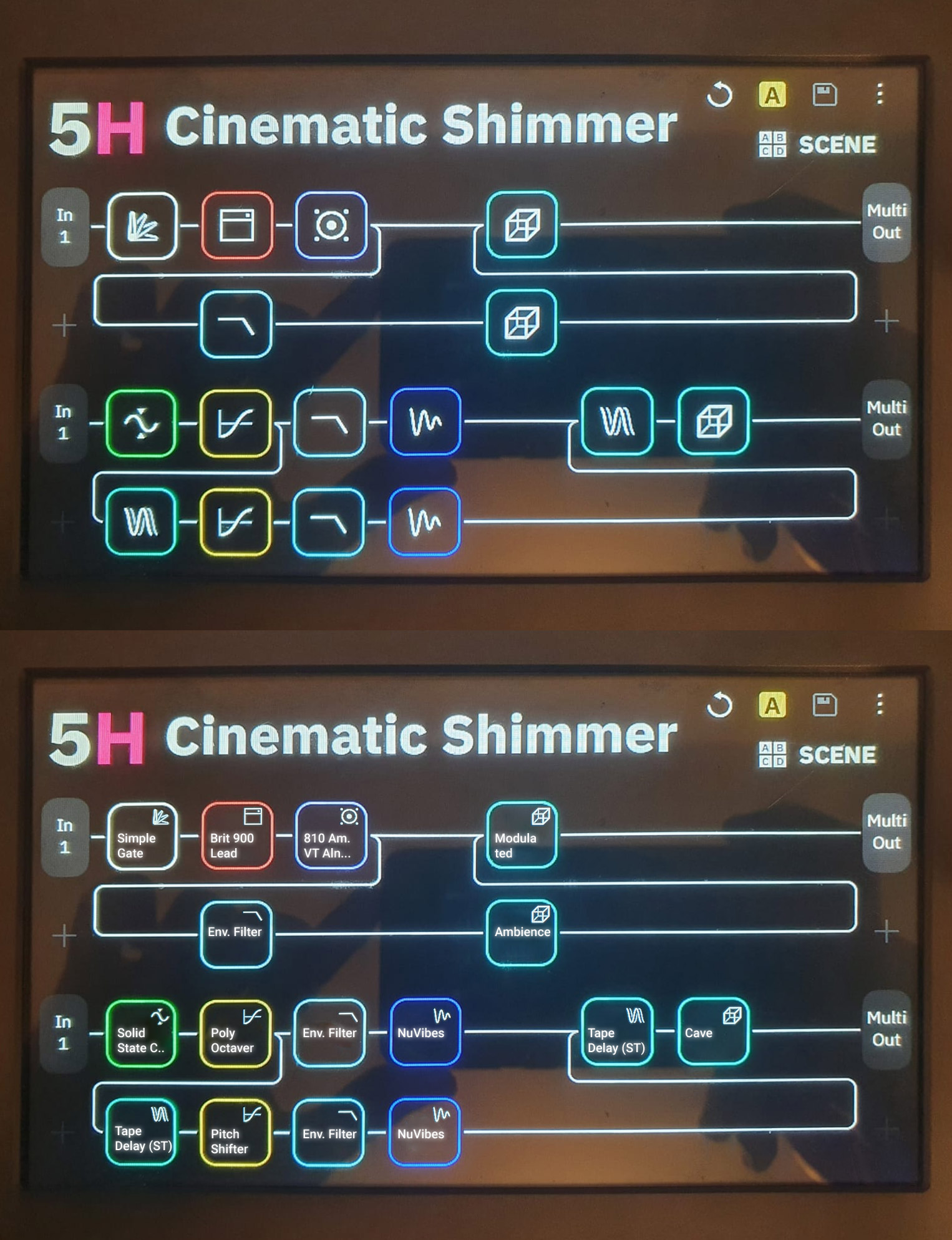
It’s time to bring the topic back into focus here. It could also look like this… I think the advantages are obvious. Always having to click on the icon to find out what exactly is behind it is a bit annoying.
Excellent feature, and something I suggested for Helix years ago. Interesting that none of the modelers do this that I’m aware of. This would have to be a parameter of the position of the block in the patch, not the block itself as the label should be based on the purpose of the block.
I also asked for years to see this on the Helix. Generic icons that provide identical images for groups of sometimes largely disparate blocks is an inadequate way to convey what is in a signal chain. More descriptive text to accompany icons is an overdue UI feature on modelers.
And another related issue is to also be able to customize the colors of certain blocks.
This is especially useful when you have reverb and delay (and especially if you have multiple of them).
See this: Custom colors in stomp block view - #2 by Shimmy